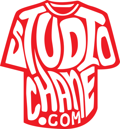
The Methodology behind Project Chane Tees
meth·od·ol·o·gy
ˌmeTHəˈdäləjē/
noun
-
a system of methods used in a particular area of study or activity.
"a methodology for investigating the concept of focal points"
So, if you were expecting a simple breakdown of how we come up with our designs methodically based on the definition above – well, you're just gonna get dizzy reading the rest of this.
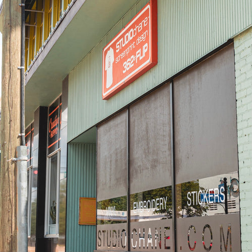
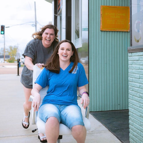
By now, most who have heard the name Project Chane or at least Chane, know us for designing tee shirts – at least locally in JXN, MS, NYC, London and in NoLa. In the earlier days, I "came up with designs" rather than designed them. Randomness was the method of let's just slap stuff on a tee and hustle like hell to sell them so we can do more.

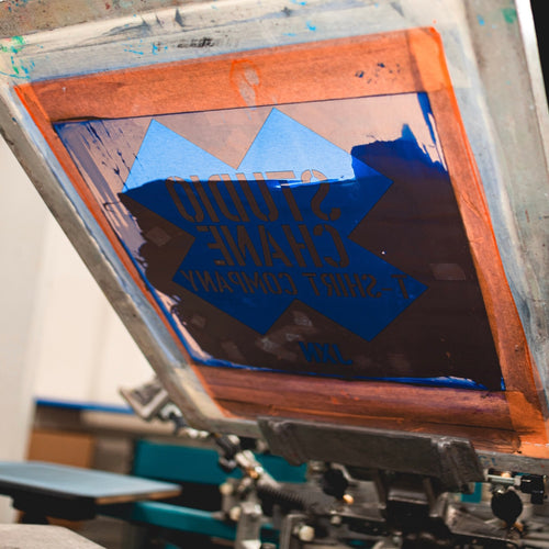
The more designs that were out there, the easier it was to eventually target what was and wasn't working among our BMX and skateboarding peers. Screen printing as a trend was really taking off with more and more funny tee shirts popping up in photos on mainstream media. We were in the company of plenty fly-by-night printers and so-called designers (well, kind of like now) and while we focused on simple logos, national brand knockoffs and our own attempt at funniness on tees, our peers would gradually fall off because either this tee shirt thing was hard work or they would go into cut & sew which would eventually be their end. We chose however to keep it simple and swim gracefully in the shallow end of the pool vs swim with the sharks.
The designs kinda got surfy in the early 90's as I was living in Pensacola Beach, Perdido Key, Orlando and L.A (that stands for Lower Alabama – a.k.a. Gulf Shores). Bright colors such as fluorescents were a big deal and we milked that trend until we burned out everyone's eyes from bright and loud and then toned it down. Upon toes touching the asphalt in NYC, this pop culture idea became relevant with the designs and would become our backbone of existence mapping out our future direction. This new world of opinion and self proclamation was the beginning of the shape we design with today. Everybody had their 2 cents worth of verbiage and we were there to catch it and turn it into art form on tee shirts. In those earlier days in NYC, we began to understand the power of local pride which eventually birthed the JXN series of tees in JXN, Mississippi.


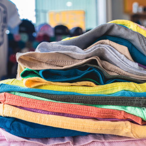
This local series of tee shirts in our hometown took off from the "git-go" as they say. Being from Mississippi, there is plenty of fodder to work with from southern pride to all of the irritations that local life faces. All of the sudden swingers, rednecks, politics, potholes, local corruption, etc. were the targets of a new art form for us. Once again everybody's 2 cents became the ingredients of local pop culture design. Our first localized design was simple. It was only 2 lines of block letters that said “SOUTH JACKSON.” Being proudly from South Jackson - with its less than perfect persona of rednecks and crime - it was a perfect design to peak intrigue for whatever reason someone wanted to wear it. And wear it they did. It even ended on a guy who wore it while doing stupid tricks on the Jay Leno show. We were off and running because it seemed like an endless supply of fodder that could go on a tee shirt – we were right and it hasn't stopped as we are still calling it like it is and producing 50 – 100 new designs per year.

Designing in this way felt more real in a sense because almost everyone around had an ingredient they threw into the bowl. We simply baked it, packaged it and sold it. Sure, you can't possibly make everyone happy with every single design. They can come into the store and laugh at the other areas of town getting ripped-on, but hemorrhage if they see one about their own neighborhood. Yes, some have even tried to introduce racial undertones to designs that never were based on such a thing. Sure, some would get their panties in a wad because they disagreed with some of our anti-political verbiage (after they laughed at all of the other tees)...but this is what became the charm of such an adverse line of tees – every single design was not for every single person. We went where no one else had gone. Yes, we set ourselves up for many a knock-off locals who wanted to get in on the bandwagon.
Outside of local ideas, I always knew that music played a huge roll in the inspiration of designing. Listening to bands such as: Smashing Pumpkins, Sigur Ros, Silversun Pickups, Bjork, Built to Spill, Interpol, etc always seemed to tip creativity just as when drinking coffee and you hit the tipping point where the caffeine kicks in and makes you super creative. Being in big cities like London and Nola also trip the senses of creativity in coming up with design ideas.
So, here were are today, making tee shirts about foods we hate and love and laughing about pooping and peeing as though we were 6 year-olds on a playground. Well, we ARE on a playground, a playground of life imitating art imitating life. Sometimes you just have to let life go – it has all become so overly serious and too politically correct to enjoy living it almost. Maybe, just maybe a little stupidity on a tee shirt will make you forget it all for a minute as we laugh at others and of course learn to laugh at ourselves.